User cards triggered in header were incorrectly positioned in Safari desktop.

Using `position()` instead of `offset()` is more consistent, since header is a fixed element in this scenario.
Handle the case of https://github.com/discourse/DiscoTOC doing this kind of setup:

```
return {
    action: "insertDtoc",
    icon: "align-left",
    label: themePrefix("insert_table_of_contents"),
    condition: !composerController.get("model.canCategorize")
  };
```

In this case there's no function to call, it's already set.
On smaller mobile devices, the height of the advanced search filters takes up
the whole real estate that it requires the user to scroll down
significantly in order to view the results.
Includes support for flags, reviewable users and queued posts, with REST API
backwards compatibility.

Co-Authored-By: romanrizzi <romanalejandro@gmail.com>
Co-Authored-By: jjaffeux <j.jaffeux@gmail.com>
Previously we relied on the provider name matching the name of the icon. Now icon names are explicitly set. Plugin providers which do not define an icon will get the default "sign-in-alt" icon
Improves usability of header search icon while user is already in full page search in mobile.

Currently, hitting search icon a second time empties input and does not scroll up to show search form.

This commit scrolls up to show form and sets focus on input.
* Revert "FIX: discourse client should know about Logster (#7232)"

This reverts commit bfcbc4d2d6.

* FIX: discourse client should know about Logster (simpler approach)
* Check if user is a member of a group or if the group has members
this is used in the template to conditionally show the relevant markup

* Check if user is suspended or if they have a bio
this is used in the template to conditionally show the relevant markup

* Simplify group-card template

* Simplify user-card template

* Refactor user and group cards CSS

* Check if user is new or if user is staff

* Style fixes

- round avatar margin
- use a more standard margin for buttons
- adds lighter font color for new users
- makes some suspension text bold (used to be <b> tags in template)
- ensures images in group bio are responsive

* user card template fixes

- adds quotes to link href attributes
- wraps some strings in tags for more consistent styling

* group card fixes

- adds quotes to link href attributes
- fixes membership button login action
- wraps some strings with tags for consistent styling

* closure action fixes

* closure action fix

* uses core variables instead of new colors and removes unused styles

* Uses better property names
## Before

```
Acceptance: Composer::Image resizing buttons: 7985ms
Acceptance: Composer::Edit the first post: 3854ms
Acceptance: Composer::Composer with dirty edit can toggle to another edit: 3707ms
Acceptance: Composer::Composer can toggle between edit and reply: 3704ms
Acceptance: Composer::Tests the Composer controls: 3685ms
Acceptance: Composer::Composer draft with dirty reply can toggle to edit: 3670ms
Acceptance: Composer::Composer can toggle layouts (open, fullscreen and draft): 3278ms
Acceptance: Composer::Switching composer whisper state: 3266ms
Acceptance: Composer::Create a topic with server side errors: 3253ms
Acceptance: Composer::Composer with dirty reply can toggle to edit: 3189ms
Acceptance: Composer::Create a Topic: 3168ms
Acceptance: Composer::Create an enqueued Topic: 2767ms
Acceptance: Composer::Posting on a different topic: 2394ms
Acceptance: Composer::Composer can switch between edits: 2318ms
Acceptance: Composer::Create an enqueued Reply: 2317ms
Acceptance: Composer::Create a Reply: 2292ms
Acceptance: Composer::Checks for existing draft: 1696ms
Acceptance: Composer::Composer can toggle between reply and createTopic: 1415ms
Acceptance: Composer::Composer can toggle whispers: 1296ms
Acceptance: Composer::Loading draft also replaces the recipients: 594ms
```

## After

```
Acceptance: Composer::Composer can toggle layouts (open, fullscreen and draft): 2305ms
Acceptance: Composer::Switching composer whisper state: 2205ms
Acceptance: Composer::Composer draft with dirty reply can toggle to edit: 2185ms
Acceptance: Composer::Composer can toggle between edit and reply: 1719ms
Acceptance: Composer::Composer with dirty edit can toggle to another edit: 1682ms
Acceptance: Composer::Composer with dirty reply can toggle to edit: 1657ms
Acceptance: Composer::Composer can toggle between reply and createTopic: 1412ms
Acceptance: Composer::Posting on a different topic: 1341ms
Acceptance: Composer::Edit the first post: 1327ms
Acceptance: Composer::Create an enqueued Reply: 1306ms
Acceptance: Composer::Composer can toggle whispers: 1265ms
Acceptance: Composer::Composer can switch between edits: 1260ms
Acceptance: Composer::Create a Reply: 1259ms
Acceptance: Composer::Create a topic with server side errors: 1183ms
Acceptance: Composer::Checks for existing draft: 1172ms
Acceptance: Composer::Create a Topic: 1130ms
Acceptance: Composer::Image resizing buttons: 921ms
Acceptance: Composer::Create an enqueued Topic: 731ms
Acceptance: Composer::Tests the Composer controls: 654ms
Acceptance: Composer::Loading draft also replaces the recipients: 540ms

```


That is not a typo... image resizing button went from 8 seconds to 1 second
This refactor addresses the following issues:

1- Moves all relevant logic to the discourse-topic component (matches desktop)
2- Fixes the flicker issue discussed here
3- Fixes a rare occurring issue where tags wrap to a third line if a topic has long category names and lots of tags
4- Fixes header icon jitter on iOS
5- Fixes an issue where sliding out user / hamburger menus on Android leaves the user in a mid-state with half a title and the header panel visible - swiping will now open the menus but have no effect on the header.
6- adds min-width to the small-logo to act as placeholder so that the title doesn't shift if the logo takes a while to load.

Other than that, everything should look and act the same.
This reverts commit d1c4981f65.

Per discussion with @coding-horror it was decided this change is to
far reaching.

Instead we will make smaller strategic changes to tooltips that add
value.
* improved emoji support

- always optimize images as part of the task
- use the unicode standard ordering/naming for sections

* UX: more height for when there are recently used
Migrates email user options to a new data structure, where `email_always`, `email_direct` and `email_private_messages` are replace by

* `email_messages_level`, with options: `always`, `only_when_away` and `never` (defaults to `always`)
* `email_level`, with options: `always`, `only_when_away` and `never` (defaults to `only_when_away`)
* FEATURE: Exposing a way to add a generic report filter
## Why do we need this change?
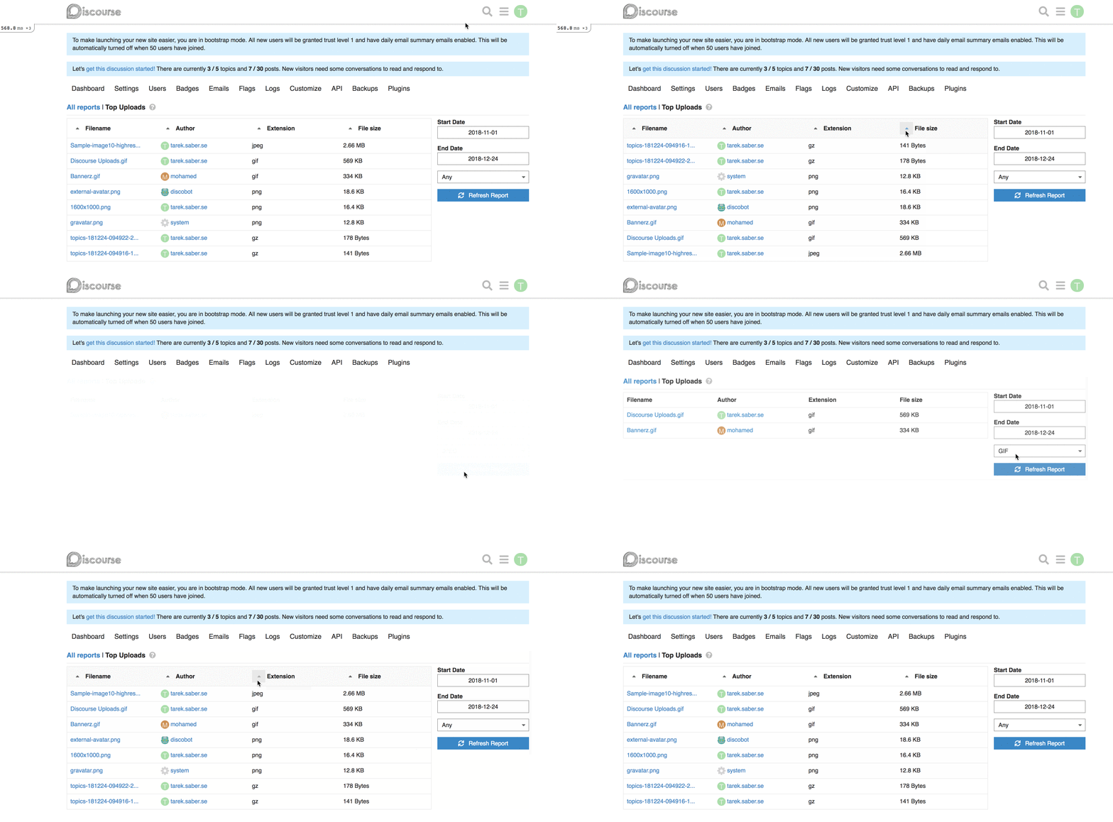
Part of the work discussed [here](https://meta.discourse.org/t/gain-understanding-of-file-uploads-usage/104994), and implemented a first spike [here](https://github.com/discourse/discourse/pull/6809), I am trying to expose a single generic filter selector per report.
## How does this work?
We basically expose a simple, single generic filter that is computed and displayed based on backend values passed into the report.
This would be a simple contract between the frontend and the backend.
**Backend changes:** we simply need to return a list of dropdown / select options, and enable the report's newly introduced `custom_filtering` property.
For example, for our [Top Uploads](https://github.com/discourse/discourse/pull/6809/files#diff-3f97cbb8726f3310e0b0c386dbe89e22R1423) report, it can look like this on the backend:
```ruby
report.custom_filtering = true
report.custom_filter_options = [{ id: "any", name: "Any" }, { id: "jpg", name: "JPEG" } ]
```
In our javascript report HTTP call, it will look like:
```js
{
"custom_filtering": true,
"custom_filter_options": [
{
"id": "any",
"name": "Any"
},
{
"id": "jpg",
"name": "JPG"
}
]
}
```
**Frontend changes:** We introduced a generic `filter` param and a `combo-box` which hooks up into the existing framework for fetching a report.
This works alright, with the limitation of being a single custom filter per report. If we wanted to add, for an instance a `filesize filter`, this will not work for us. _I went through with this approach because it is hard to predict and build abstractions for requirements or problems we don't have yet, or might not have._
## How does it look like?

## More on the bigger picture
The major concern here I have is the solution I introduced might serve the `think small` version of the reporting work, but I don't think it serves the `think big`, I will try to shed some light into why.
Within the current design, It is hard to maintain QueryParams for dynamically generated params (based on the idea of introducing more than one custom filter per report).
To allow ourselves to have more than one generic filter, we will need to:
a. Use the Route's model to retrieve the report's payload (we are now dependent on changes of the QueryParams via computed properties)
b. After retrieving the payload, we can use the `setupController` to define our dynamic QueryParams based on the custom filters definitions we received from the backend
c. Load a custom filter specific Ember component based on the definitions we received from the backend
Since uploads site settings are now backed by an actual upload, we don't
have to reach over the network just to fetch the favicon. Instead, we
can just read the upload directly from disk.
* FEATURE: Add ignored user list to the User's preference page
## Why?
Part of: https://meta.discourse.org/t/ability-to-ignore-a-user/110254
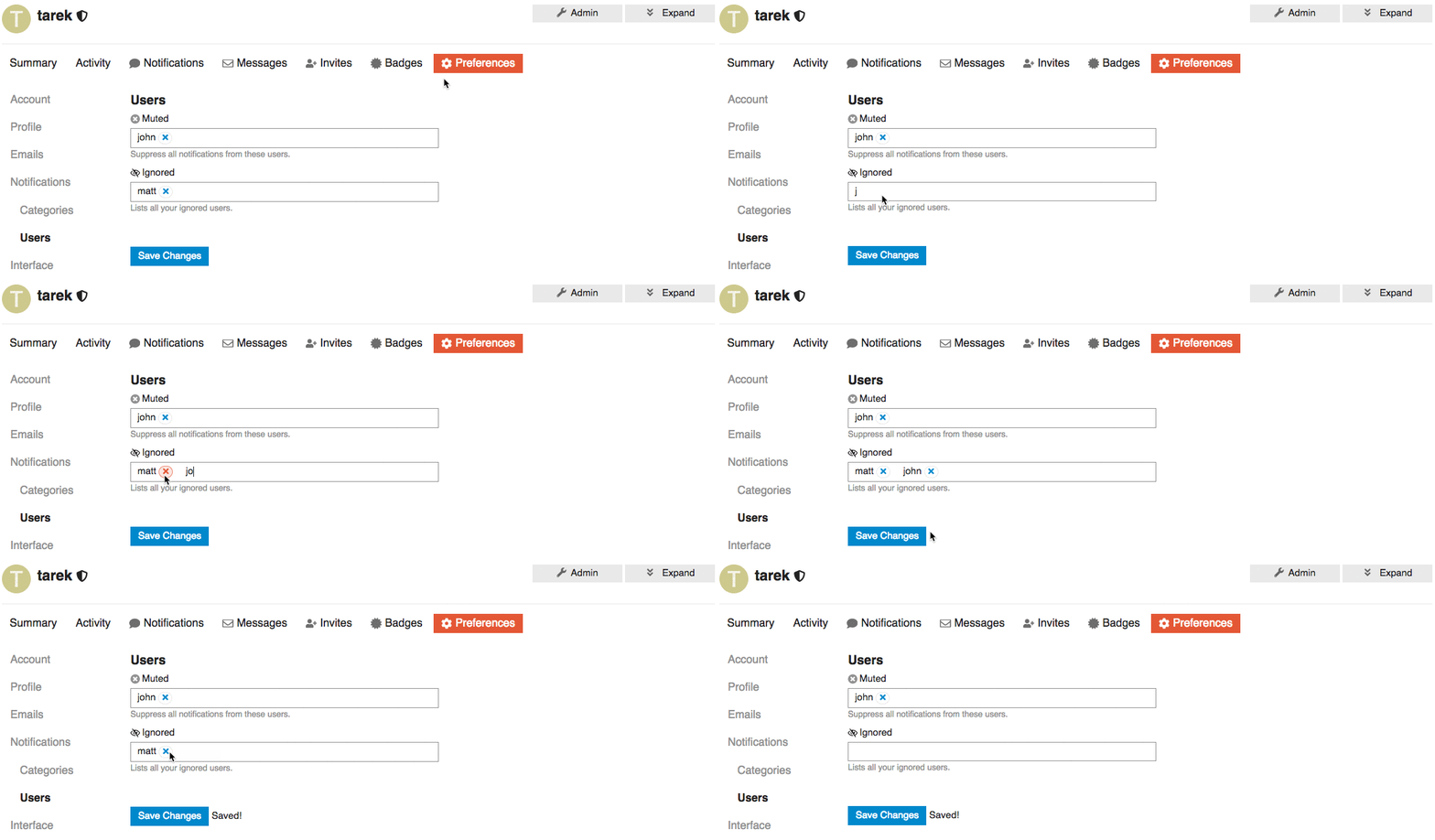
We want to add list of Ignored users under or along with the muted users preferences section.
This way Users can find and update their list of ignored users.
## UI

## Open questions
Two of many options to represent a list of ignored users is that we can:
1. We can represent the ignored user list as a table with the ability to `un-ignore` but NOT to add new ignored users.
2. We can keep it functioning as the `muted user list` where you can `un-ignore` or `ignore` users.
* Adds warnings to the "Edit Category" dialog
* Doesn't hide the "Security" tab on the "Edit Category" dialog anymore. Instead, it shows an explanation why permissions can't be changed.
* Makes the category name translatable
* Hides the category name from the edit dialog (it can be customized by overriding the translation)
* Creates a translation override if the category has been renamed in the past
This disables a bunch of hacks that bypassed "focus" on iOS (cause focus
events that involve a virtual keyboard on iOS cause browser havoc unless
a physical keyboard is attached)

Also will focus on title on new topic
Sadly there is no clean way of detecting a keyboard is connected to an iPad

If the keyboard is connected we want to disable all the touch related hacks
on iOS

This allows iPad users to specify they have a keyboard connected. Setting
is per device.