mirror of
https://github.com/discourse/discourse.git
synced 2025-02-25 23:29:55 +08:00
 097d987332
This adds the class `composer-has-preview` to the HTML element when the composer is opened and the preview is visible. This allows us to adjust the sidebar height, so that the previewless composer can overlap the sidebar and better utilize the available space. Before:  After: 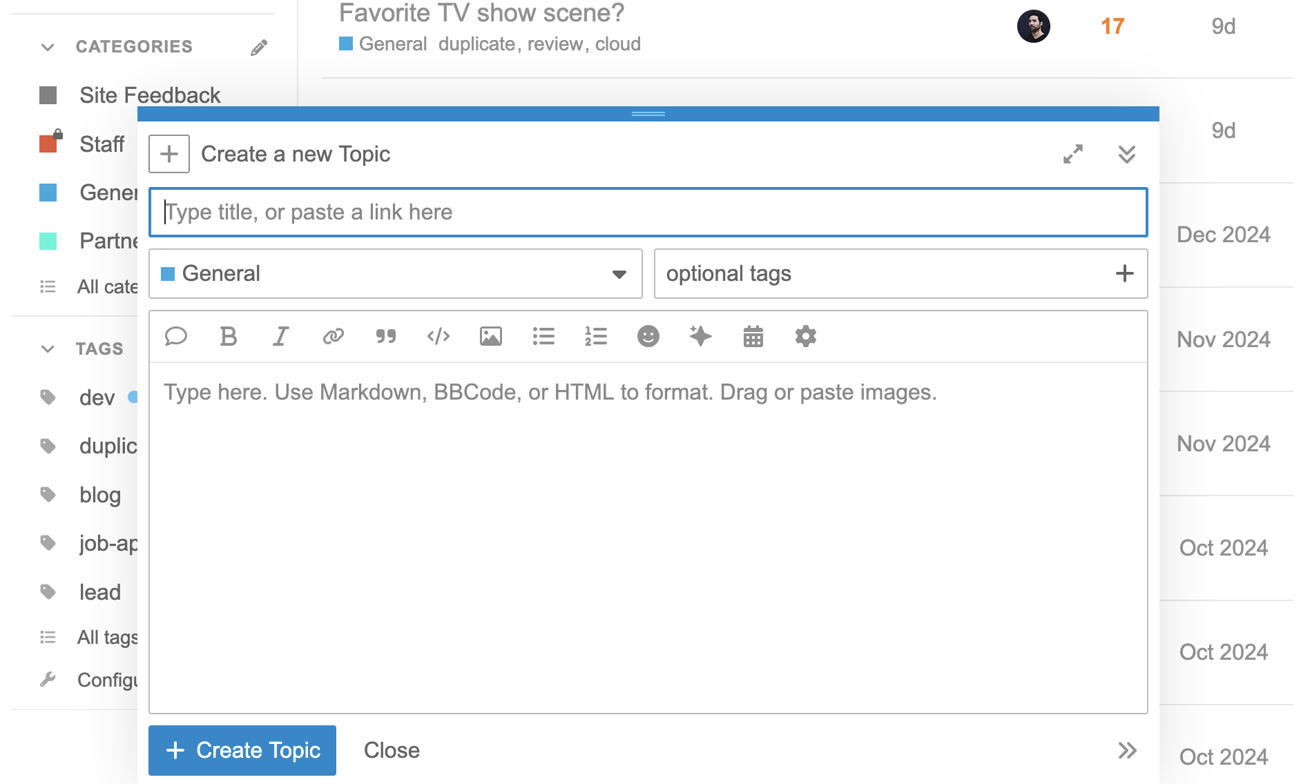
429 lines
8.9 KiB
SCSS
429 lines
8.9 KiB
SCSS
:root {
|
|
--d-sidebar-width: #{$d-sidebar-width};
|
|
@include breakpoint(large) {
|
|
--d-sidebar-width: #{$d-sidebar-narrow-width};
|
|
}
|
|
|
|
--d-sidebar-row-horizontal-padding: 1rem;
|
|
|
|
// ems so height is variable along with font size
|
|
--d-sidebar-row-height: 2.2em;
|
|
--d-sidebar-animation-time: 0.25s;
|
|
--d-sidebar-animation-ease: ease-in-out;
|
|
--d-sidebar-background: var(--secondary);
|
|
--d-sidebar-admin-background: var(--primary-very-low);
|
|
|
|
// must be rgba for gradient
|
|
--d-sidebar-footer-fade: rgba(var(--secondary-rgb), 1);
|
|
--d-sidebar-header-color: var(--primary-medium);
|
|
--d-sidebar-header-icon-color: var(--primary-medium);
|
|
--d-sidebar-border-color: var(--primary-low);
|
|
--d-sidebar-link-color: var(--primary-high);
|
|
--d-sidebar-link-icon-color: var(--primary-500);
|
|
--d-sidebar-link-badge-color: var(--primary-700); // example: new count
|
|
|
|
// example: chat participant count
|
|
--d-sidebar-prefix-background: var(--primary-low);
|
|
--d-sidebar-prefix-color: var(--d-sidebar-link-color);
|
|
|
|
// example: unread dot
|
|
--d-sidebar-suffix-color: var(--tertiary-med-or-tertiary);
|
|
|
|
// highlight applies to both hover and focus states
|
|
--d-sidebar-highlight-background: var(--primary-low);
|
|
--d-sidebar-highlight-color: var(--primary-high);
|
|
--d-sidebar-highlight-prefix-background: var(--primary-300);
|
|
--d-sidebar-highlight-prefix-color: var(--d-sidebar-highlight-color);
|
|
--d-sidebar-highlight-suffix-color: var(--tertiary-med-or-tertiary);
|
|
--d-sidebar-highlight-hover-background: var(
|
|
--primary-medium
|
|
); // example: hovering a button within a highlighted section
|
|
|
|
--d-sidebar-highlight-hover-icon: var(
|
|
--primary-very-low
|
|
); // example: hovering a button within a highlighted section
|
|
|
|
--d-sidebar-active-background: var(--d-selected);
|
|
--d-sidebar-active-color: var(--d-sidebar-link-color);
|
|
--d-sidebar-active-icon-color: var(--d-sidebar-link-color);
|
|
--d-sidebar-active-prefix-background: var(--primary-200);
|
|
--d-sidebar-active-suffix-color: var(--tertiary-med-or-tertiary);
|
|
}
|
|
|
|
.sidebar-row {
|
|
box-sizing: border-box;
|
|
height: var(--d-sidebar-row-height);
|
|
padding: 0 var(--d-sidebar-row-horizontal-padding);
|
|
align-items: center;
|
|
}
|
|
|
|
.sidebar-wrapper {
|
|
display: flex;
|
|
grid-area: sidebar;
|
|
position: sticky;
|
|
top: var(--main-outlet-offset);
|
|
background: var(--d-sidebar-background);
|
|
|
|
@include unselectable;
|
|
|
|
// 1dvh with fallback for old browsers
|
|
--1dvh: 1vh;
|
|
@supports (height: 1dvh) {
|
|
--1dvh: 1dvh;
|
|
}
|
|
height: calc(
|
|
var(--composer-vh, var(--1dvh)) * 100 - var(--main-outlet-offset, 0px)
|
|
);
|
|
align-self: start;
|
|
overflow-y: auto;
|
|
|
|
.sidebar-container {
|
|
display: flex;
|
|
flex-direction: column;
|
|
box-sizing: border-box;
|
|
width: 100%;
|
|
padding: 0;
|
|
border-right: 1px solid var(--primary-low);
|
|
overflow-x: hidden;
|
|
|
|
// allows sidebar to scroll to the bottom when the composer is open
|
|
height: calc(100% - var(--composer-height, 0px));
|
|
|
|
html:not(.composer-has-preview) & {
|
|
height: 100%;
|
|
}
|
|
}
|
|
|
|
.sidebar-sections {
|
|
display: flex;
|
|
flex-direction: column;
|
|
box-sizing: border-box;
|
|
flex: 1;
|
|
padding: 1.5rem 1rem 1rem;
|
|
overflow-x: hidden;
|
|
overflow-y: overlay;
|
|
|
|
> .sidebar-section-wrapper:last-child {
|
|
border-bottom: 0;
|
|
}
|
|
|
|
// custom scrollbar styling
|
|
--scrollbarBg: transparent;
|
|
--scrollbarThumbBg: var(--primary-low);
|
|
--scrollbarWidth: 0.5em;
|
|
scrollbar-color: transparent var(--scrollbarBg);
|
|
transition: scrollbar-color 0.25s ease-in-out;
|
|
transition-delay: 0.5s;
|
|
|
|
&::-webkit-scrollbar {
|
|
width: var(--scrollbarWidth);
|
|
}
|
|
|
|
&::-webkit-scrollbar-thumb {
|
|
background-color: transparent;
|
|
border-radius: calc(var(--scrollbarWidth) / 2);
|
|
}
|
|
|
|
&::-webkit-scrollbar-track {
|
|
background-color: transparent;
|
|
}
|
|
|
|
&:hover {
|
|
scrollbar-color: var(--scrollbarThumbBg) var(--scrollbarBg);
|
|
|
|
&::-webkit-scrollbar-thumb {
|
|
background-color: var(--scrollbarThumbBg);
|
|
}
|
|
transition-delay: 0s;
|
|
}
|
|
|
|
&__back-to-forum {
|
|
color: var(--d-sidebar-link-color);
|
|
display: flex;
|
|
align-items: center;
|
|
|
|
svg {
|
|
margin-right: var(--d-sidebar-section-link-prefix-margin-right);
|
|
height: 0.75em;
|
|
width: 0.75em;
|
|
color: var(--d-sidebar-link-icon-color);
|
|
}
|
|
}
|
|
}
|
|
}
|
|
|
|
.sidebar-section-form-modal {
|
|
.draggable {
|
|
display: flex;
|
|
height: 100%;
|
|
width: 100%;
|
|
justify-content: center;
|
|
align-items: center;
|
|
color: var(--primary-medium);
|
|
align-self: center;
|
|
margin-left: auto;
|
|
margin-right: auto;
|
|
cursor: move;
|
|
-webkit-user-drag: element;
|
|
}
|
|
|
|
.dragging {
|
|
opacity: 0.4;
|
|
}
|
|
|
|
form {
|
|
margin-bottom: 0;
|
|
}
|
|
|
|
.input-group input {
|
|
width: 100%;
|
|
margin-bottom: 0;
|
|
}
|
|
|
|
input.warning {
|
|
border: 1px solid var(--danger);
|
|
}
|
|
|
|
.icon.warning,
|
|
.value.warning {
|
|
position: absolute;
|
|
}
|
|
|
|
.sidebar-section-form__input-wrapper {
|
|
margin-bottom: 1em;
|
|
|
|
input {
|
|
width: 100%;
|
|
}
|
|
}
|
|
|
|
.row-wrapper {
|
|
display: grid;
|
|
grid-template-columns: 2em 4.5em repeat(2, 1fr) 2em;
|
|
padding: 0.55em 0 0.7em;
|
|
-webkit-user-drag: none;
|
|
cursor: default;
|
|
border-top: 2px solid transparent;
|
|
border-bottom: 2px solid transparent;
|
|
margin-bottom: -2px;
|
|
|
|
&.header {
|
|
padding-bottom: 0;
|
|
|
|
label {
|
|
margin-bottom: 0;
|
|
}
|
|
}
|
|
|
|
&.drag-above {
|
|
border-top: 2px solid var(--tertiary);
|
|
}
|
|
|
|
&.drag-below {
|
|
border-bottom: 2px solid var(--tertiary);
|
|
}
|
|
|
|
.link-icon {
|
|
grid-column: 2;
|
|
}
|
|
|
|
.input-group {
|
|
margin: 0 0.5em;
|
|
@include breakpoint(mobile-large) {
|
|
margin: 0 0.25em;
|
|
}
|
|
}
|
|
}
|
|
|
|
.always-public-tooltip {
|
|
padding-right: 0.5rem;
|
|
}
|
|
|
|
.btn-flat.add-link {
|
|
margin-top: 0.5em;
|
|
margin-left: -0.5em;
|
|
|
|
&:active,
|
|
&:focus {
|
|
background: none;
|
|
}
|
|
|
|
svg {
|
|
color: var(--tertiary);
|
|
width: 0.75em;
|
|
height: 0.75em;
|
|
}
|
|
|
|
&:hover svg {
|
|
color: var(--tertiary-hover);
|
|
}
|
|
}
|
|
|
|
.d-modal__footer {
|
|
display: grid;
|
|
grid-template-columns: auto 1fr auto;
|
|
gap: 0.5em 1em;
|
|
@include breakpoint(mobile-extra-large) {
|
|
grid-template-columns: auto 1fr;
|
|
justify-items: left;
|
|
|
|
.mark-public-wrapper {
|
|
grid-row: 1;
|
|
grid-column: 1 / span 2;
|
|
}
|
|
|
|
.checkbox-label {
|
|
padding: 0 0 0.5em 0;
|
|
}
|
|
}
|
|
|
|
.reset-link,
|
|
.delete {
|
|
margin: 0;
|
|
justify-self: right;
|
|
}
|
|
|
|
.mark-public-wrapper {
|
|
&.-disabled label {
|
|
cursor: not-allowed;
|
|
}
|
|
|
|
.checkbox-label {
|
|
margin: 0;
|
|
}
|
|
}
|
|
}
|
|
|
|
.select-kit.multi-select .multi-select-header .formatted-selection {
|
|
display: none;
|
|
}
|
|
|
|
.select-kit.is-expanded .select-kit-body {
|
|
min-width: 220px;
|
|
}
|
|
|
|
.reset-link {
|
|
margin-right: 0;
|
|
|
|
.discourse-no-touch & {
|
|
&:hover {
|
|
.d-icon {
|
|
color: var(--tertiary-hover);
|
|
}
|
|
}
|
|
}
|
|
|
|
.d-icon {
|
|
font-size: var(--font-down-1);
|
|
color: var(--tertiary);
|
|
}
|
|
}
|
|
|
|
.delete-link {
|
|
.d-icon {
|
|
color: var(--primary-medium);
|
|
}
|
|
|
|
.discourse-no-touch & {
|
|
&:hover {
|
|
.d-icon {
|
|
color: var(--danger);
|
|
}
|
|
}
|
|
}
|
|
}
|
|
}
|
|
|
|
.sidebar__panel-switch-button {
|
|
margin: 1em 1.3em 0 1.3em;
|
|
|
|
&:last-of-type {
|
|
margin-bottom: 1em;
|
|
}
|
|
}
|
|
|
|
.sidebar-filter {
|
|
margin-top: 1em;
|
|
margin-bottom: 1em;
|
|
border: 1px solid var(--primary-400);
|
|
border-radius: var(--d-input-border-radius);
|
|
background: var(--secondary);
|
|
width: calc(
|
|
var(--d-sidebar-width) - 2 * var(--d-sidebar-row-horizontal-padding)
|
|
);
|
|
|
|
&:focus-within {
|
|
border-color: var(--tertiary);
|
|
outline: 1px solid var(--tertiary);
|
|
outline-offset: -1px;
|
|
}
|
|
|
|
&__input-container {
|
|
position: relative;
|
|
display: flex;
|
|
align-items: center;
|
|
background: var(--secondary);
|
|
border-radius: var(--d-input-border-radius);
|
|
}
|
|
|
|
&__shortcut-hint {
|
|
background-color: rgba(var(--tertiary-rgb), 0.1);
|
|
padding: 0.25em 0.5em;
|
|
margin-right: 0.5em;
|
|
font-size: var(--font-down-3);
|
|
color: var(--primary-medium);
|
|
}
|
|
|
|
&__input[type="text"] {
|
|
border: 0;
|
|
background: none;
|
|
margin-bottom: 0;
|
|
height: 2em;
|
|
|
|
&:focus-within {
|
|
outline: 0;
|
|
}
|
|
width: 100%;
|
|
}
|
|
|
|
&__clear {
|
|
width: 2em;
|
|
height: 2em;
|
|
color: var(--primary-medium);
|
|
background-color: var(--secondary);
|
|
}
|
|
}
|
|
|
|
.sidebar-no-results {
|
|
margin: 0.5em var(--d-sidebar-row-horizontal-padding) 0
|
|
var(--d-sidebar-row-horizontal-padding);
|
|
|
|
&__title {
|
|
font-weight: bold;
|
|
}
|
|
}
|
|
|
|
.sidebar-no-results {
|
|
display: block;
|
|
}
|
|
|
|
.sidebar-panel-header__row {
|
|
display: flex;
|
|
justify-content: space-between;
|
|
align-items: baseline;
|
|
color: var(--d-sidebar-link-color);
|
|
width: calc(
|
|
var(--d-sidebar-width) * var(--d-sidebar-row-horizontal-padding) + 2px
|
|
);
|
|
}
|
|
|
|
.sidebar-toggle-all-sections.btn-transparent {
|
|
padding-right: 0;
|
|
color: var(--d-sidebar-link-color);
|
|
|
|
svg {
|
|
width: 0.75em;
|
|
height: 0.85em;
|
|
}
|
|
}
|