Commit Graph

472 Commits

Author SHA1 Message Date
Kerwin Bryant
9b0743ae33
Extract common code to new template (#26933)
Same as #26903
2023-09-06 10:11:06 +00:00
wxiaoguang
c17fd68be7
Show queue's active worker number (#26896) 2023-09-04 21:07:32 +08:00
Denys Konovalov
5b5bb8d354
User details page (#26713)
This PR implements a proposal to clean up the admin users table by
moving some information out to a separate user details page (which also
displays some additional information).

Other changes:
- move edit user page from `/admin/users/{id}` to
`/admin/users/{id}/edit` -> `/admin/users/{id}` now shows the user
details page
- show if user is instance administrator as a label instead of a
separate column
- separate explore users template into a page- and a shared one, to make
it possible to use it on the user details page
- fix issue where there was no margin between alert message and
following content on admin pages

<details>

<summary>Screenshots</summary>


![grafik](https://github.com/go-gitea/gitea/assets/47871822/1ad57ac9-f20a-45a4-8477-ffe572a41e9e)


![grafik](https://github.com/go-gitea/gitea/assets/47871822/25786ecd-cb9d-4c92-90f4-e7f4292c073b)


</details>

Partially resolves #25939

---------

Co-authored-by: Giteabot <teabot@gitea.io>
2023-08-31 11:21:18 +02:00
wxiaoguang
19a1e1b20e
Remove polluted .ui.right (#26825)
Each change is tested manually line by line. There are too many changes
so I can't share dozens of screenshots.

In short:

1. `ui right` could be still used in `ui top attached header`, because
there is a special case.
2. A lot of `ui right` are just no-op, so they can be removed safely.
3. Some of the `ui right` should be replaced by `gt-float-right` (to
avoid breaking, leave them to the future).
4. A few of the `ui right` could be rewritten by flex.
2023-08-31 02:29:59 +00:00
wxiaoguang
576644d815
Simplify helper CSS classes and avoid abuse (#26728)
Removed CSS helper classes (some of them are not useful while some of
them are abused often)

* `gt-db`: in most cases it could be replaced by `gt-df` and the flex
layout should be encouraged. Other cases: either it does need the
`gt-df` (eg: by using `div` directly) or it is an abuse (eg: the warning
message in a form)
* `gt-di`: it doesn't seem useful, or it could be replaced by `gt-dib`
in most cases.
* `gt-dif`: not useful, it could be replaced by `flex-text-inline` or
`gt-df`
* `gt-js`: never used
* All `<i class="icon gt-df gt-ac gt-jc">` could be written as `<i
class="icon">`


## Some UI samples

### Admin Notice


![image](https://github.com/go-gitea/gitea/assets/2114189/d02010d4-dc7d-463f-bc99-dcc9b6e2e2ac)

### Admin Stacktrace


![image](https://github.com/go-gitea/gitea/assets/2114189/4045695c-a8c4-4e37-b720-e77a61b1e965)

### Org Home


![image](https://github.com/go-gitea/gitea/assets/2114189/069f02d0-76ad-4052-8a80-700d7e501d40)

### Org Team Repo


![image](https://github.com/go-gitea/gitea/assets/2114189/dc8d6106-bb6b-4f60-83ac-06cb28df3ab5)

### Release List


![image](https://github.com/go-gitea/gitea/assets/2114189/0845e8a5-d1a9-487a-9d25-3c200ad54c17)


### User Setting Application Token Scope


![image](https://github.com/go-gitea/gitea/assets/2114189/fffbde27-432b-49c6-827e-17b8cd3457ff)

Co-authored-by: Giteabot <teabot@gitea.io>
2023-08-26 01:35:10 +02:00
wxiaoguang
e8b990999f
Make "link-action" backend code respond correct JSON content (#26680)
Otherwise the `link-action` JS code couldn't parse the response.

Co-authored-by: Giteabot <teabot@gitea.io>
2023-08-23 17:36:57 +08:00
yp05327
9665622378
Differentiate better between user settings and admin settings (#26538)
User settings page and admin settings page are too similar. I thinlk
this will be better of using `User Settings` and `Admin Settings` as the
navbar's title.

Before:

![image](https://github.com/go-gitea/gitea/assets/18380374/68db06f3-918b-41bc-b4d3-522b1057eb57)

![image](https://github.com/go-gitea/gitea/assets/18380374/24f53d91-54e1-410c-ad9b-438bb2c8069f)

After:

![image](https://github.com/go-gitea/gitea/assets/18380374/6600a872-d630-4ea6-a58f-d9ded7d38067)

![image](https://github.com/go-gitea/gitea/assets/18380374/501cde5d-9868-4cba-829d-ff8bafce695d)
2023-08-16 10:12:03 +00:00
wxiaoguang
71d253f42e
Remove unnecessary template helper DisableGravatar (#26386)
And one "AllowedUserVisibilityModes" was missing, add it.

Co-authored-by: Giteabot <teabot@gitea.io>
2023-08-08 08:29:14 +00:00
KN4CK3R
0c6ae61229
Allow package cleanup from admin page (#25307)
Until now expired package data gets deleted daily by a cronjob. The
admin page shows the size of all packages and the size of unreferenced
data. The users (#25035, #20631) expect the deletion of this data if
they run the cronjob from the admin page but the job only deletes data
older than 24h.

This PR adds a new button which deletes all expired data.

![grafik](https://github.com/go-gitea/gitea/assets/1666336/b3e35d73-9496-4fa7-a20c-e5d30b1f6850)

---------

Co-authored-by: silverwind <me@silverwind.io>
2023-08-08 00:46:10 +00:00
silverwind
72363be7ca
Use shared template for webhook icons (#26242)
Fixes: https://github.com/go-gitea/gitea/issues/26241
2023-07-31 08:00:52 +00:00
silverwind
7e160f8824
Reduce margins on user settings page, introduce flex-container (#26046)
Same as https://github.com/go-gitea/gitea/pull/26026 but for the user
settings page. It introduces a new `flex-container` class and shares it
across both pages.

Before and After:
<img width="1264" alt="Screenshot 2023-07-21 at 19 35 57"
src="https://github.com/go-gitea/gitea/assets/115237/1358dab4-55c0-40ce-a4d5-673099304f3d">
<img width="1269" alt="Screenshot 2023-07-21 at 19 35 42"
src="https://github.com/go-gitea/gitea/assets/115237/34812f6d-dc65-4009-b977-90e03efdc6d1">
2023-07-31 07:16:03 +00:00
Lunny Xiao
5dc37ef97a
Display deprecated warning in admin panel pages as well as in the log file (#26094)
This PR includes #26007 's changes but have a UI to prompt administrator
about the deprecated settings as well as the log or console warning.
Then users will have enough time to notice the problem and don't have
surprise like before.

<img width="1293" alt="图片"
src="https://github.com/go-gitea/gitea/assets/81045/c33355f0-1ea7-4fb3-ad43-cd23cd15391d">

---------

Co-authored-by: wxiaoguang <wxiaoguang@gmail.com>
2023-07-26 03:53:37 +00:00
HesterG
24c3bb95ac
Categorize admin settings sidebar panel (#26030)
This PR reorganize and categorize the admin settings sidebar panel into
groups:

- User Accounts, User Emails, Organizations, Authentication Sources ->
Identity & Access
- Repositories, Packages -> Code Assets
- Webhooks, Applications -> Integrations

Before:

<img width="1346" alt="Screen Shot 2023-07-21 at 10 30 28"
src="https://github.com/go-gitea/gitea/assets/17645053/e0c5ae83-464f-4aaa-8bab-2c5258c9278d">

After:

all configurable settings enabled (package, oauth, webhook)

<img width="1153" alt="Screen Shot 2023-07-21 at 10 27 30"
src="https://github.com/go-gitea/gitea/assets/17645053/88acf3f5-0623-4307-8654-69c654d80874">

all configurable settings disabled (package, oauth, webhook)

<img width="1391" alt="Screen Shot 2023-07-21 at 10 25 19"
src="https://github.com/go-gitea/gitea/assets/17645053/9e13aa60-e75c-4077-afd6-3da9e0ae18dd">

only oauth enabled

<img width="1323" alt="Screen Shot 2023-07-21 at 10 26 23"
src="https://github.com/go-gitea/gitea/assets/17645053/ce4f9ec0-b141-4d5e-ac13-46d001724dc5">

only webhook enabled

<img width="1350" alt="Screen Shot 2023-07-21 at 10 26 55"
src="https://github.com/go-gitea/gitea/assets/17645053/702491bd-083e-44fa-82bc-52c4571e54ac">
2023-07-24 09:05:16 +08:00
wxiaoguang
a7e8273574
Fix the truncate and alignment problem for some admin tables (#26042)
Some "text truncate email" code were just copied&pasted, they are not
suitable for most admin tables.

For the table layouts, some "max-width" helpers could be very helpful.
At least, we can get rid of the confusing "email" CSS class.

![image](https://github.com/go-gitea/gitea/assets/2114189/0b0bd068-56fc-41cf-b4a3-ed45eb797401)

![image](https://github.com/go-gitea/gitea/assets/2114189/e7f843a3-5f46-4205-b383-4c7ef647ce83)

![image](https://github.com/go-gitea/gitea/assets/2114189/ce8d65e1-7e03-466e-a03b-9bd33815da91)
2023-07-22 10:54:48 +00:00
silverwind
d021c88d29
Reduce margins on admin pages (#26026)
Reduce margins around admin boxes and reduce sidebar size from 275px to
240px. This is the same 16px margin we use on issue pages.

Before and After:
<img width="1270" alt="Screenshot 2023-07-21 at 00 28 11"
src="https://github.com/go-gitea/gitea/assets/115237/f9b0dcb0-8f7e-49b4-b130-54bf31c142fd">
<img width="1271" alt="Screenshot 2023-07-21 at 00 30 51"
src="https://github.com/go-gitea/gitea/assets/115237/ddd75d59-9ab9-4061-8989-852e89727560">
2023-07-21 03:11:42 +00:00
wxiaoguang
50e14699d3
Update path related documents (#25417)
Update WorkPath/WORK_PATH related documents, remove out-dated
information.

Remove "StaticRootPath" on the admin config display page, because few
end user really need it, it only causes misconfiguration.


![image](https://github.com/go-gitea/gitea/assets/2114189/8095afa4-da76-436b-9e89-2a92c229c01d)

Co-authored-by: Giteabot <teabot@gitea.io>
2023-07-19 11:22:57 +02:00
silverwind
61e0d1a767
Enable H014 and H023 djlint rules (#25786)
Enable these rules:

- H014 | More than 2 blank lines.
- H023 | Do not use entity references.

There are more potential rules to enable but they are blocked by bugs in
the linter:

- https://github.com/Riverside-Healthcare/djLint/issues/711
- https://github.com/Riverside-Healthcare/djLint/issues/712
2023-07-09 20:33:25 +00:00
silverwind
64f2d70262
Replace fomantic divider module with our own (#25539)
Should look exactly like before for normal dividers. "Horizontal" ones
look better because they no longer use image backgrounds.

<img width="917" alt="Screenshot 2023-06-27 at 19 07 56"
src="https://github.com/go-gitea/gitea/assets/115237/d97d8dec-6859-44a8-85ba-e4549b4dd9df">

<img width="914" alt="Screenshot 2023-06-27 at 19 05 58"
src="https://github.com/go-gitea/gitea/assets/115237/8bf98544-2d82-4ebf-ac68-d6dc237bd6b2">

<img width="1246" alt="Screenshot 2023-06-27 at 19 00 42"
src="https://github.com/go-gitea/gitea/assets/115237/36a6bb21-6029-4f53-8bee-535f55c66fed">

<img width="344" alt="Screenshot 2023-06-27 at 18 58 15"
src="https://github.com/go-gitea/gitea/assets/115237/a9e70aee-8e6b-4ea1-9e93-19c9f96aec6e">
<img width="823" alt="Screenshot 2023-06-27 at 18 56 22"
src="https://github.com/go-gitea/gitea/assets/115237/e7a497cd-f262-4683-8872-23c3c8cce32f">

<img width="330" alt="Screenshot 2023-06-27 at 19 21 11"
src="https://github.com/go-gitea/gitea/assets/115237/42f24149-a655-4c7e-bd26-8ab52db6446b">
2023-06-29 20:24:22 +08:00
Lunny Xiao
6e19484f4d
Sync branches into databases (#22743)
Related #14180
Related #25233 
Related #22639
Close #19786
Related #12763 

This PR will change all the branches retrieve method from reading git
data to read database to reduce git read operations.

- [x] Sync git branches information into database when push git data
- [x] Create a new table `Branch`, merge some columns of `DeletedBranch`
into `Branch` table and drop the table `DeletedBranch`.
- [x] Read `Branch` table when visit `code` -> `branch` page
- [x] Read `Branch` table when list branch names in `code` page dropdown
- [x] Read `Branch` table when list git ref compare page
- [x] Provide a button in admin page to manually sync all branches.
- [x] Sync branches if repository is not empty but database branches are
empty when visiting pages with branches list
- [x] Use `commit_time desc` as the default FindBranch order by to keep
consistent as before and deleted branches will be always at the end.

---------

Co-authored-by: Jason Song <i@wolfogre.com>
2023-06-29 10:03:20 +00:00
a1012112796
4aba8a6a5f
Split lfs size from repository size (#22900)
releated to #21820

- Split `Size` in repository table as two new colunms, one is `GitSize`
for git size, the other is `LFSSize` for lfs data. still store full size
in `Size` colunm.
- Show full size on ui, but show each of them by a `title`;  example:

![image](https://user-images.githubusercontent.com/25342410/218636251-e200f085-d7e7-4a25-9ff1-b586a63e07a9.png)

- Return full size in api response.

---------

Signed-off-by: a1012112796 <1012112796@qq.com>
Co-authored-by: Lunny Xiao <xiaolunwen@gmail.com>
Co-authored-by: silverwind <me@silverwind.io>
Co-authored-by: DmitryFrolovTri <23313323+DmitryFrolovTri@users.noreply.github.com>
Co-authored-by: Giteabot <teabot@gitea.io>
2023-06-28 22:41:02 +00:00
HesterG
c082689471
Use flex instead of float for sort button and search input (#25519)
Right now some sort buttons beside search input are unclickable because
#25338 removed `max-width` and the sort button is using float, sort
button is then covered by the `input`.

The way to fix this in this PR is changing the layout to `flex` and put
`input form` and sort `button` into `secondary menu`.

After:

<img width="1411" alt="Screen Shot 2023-06-26 at 16 40 52"
src="https://github.com/go-gitea/gitea/assets/17645053/63c12b17-793a-4ae7-bbda-f67b13b87212">

<img width="1428" alt="Screen Shot 2023-06-26 at 16 34 06"
src="https://github.com/go-gitea/gitea/assets/17645053/cb7d967e-355d-4cb0-955c-6139580fc17a">
<img width="716" alt="Screen Shot 2023-06-26 at 16 34 22"
src="https://github.com/go-gitea/gitea/assets/17645053/c74b5ef2-d46e-4487-8794-28bec984bb36">
<img width="1424" alt="Screen Shot 2023-06-26 at 16 34 32"
src="https://github.com/go-gitea/gitea/assets/17645053/8a5fdc05-a2c5-4ec4-979d-15a21501fe14">
<img width="1425" alt="Screen Shot 2023-06-26 at 16 35 21"
src="https://github.com/go-gitea/gitea/assets/17645053/eb73cd31-3914-4bc9-92ab-aba56f25128b">
<img width="1437" alt="Screen Shot 2023-06-26 at 16 36 14"
src="https://github.com/go-gitea/gitea/assets/17645053/1c3b4595-bb26-491f-aa68-60dc9ab22b84">
2023-06-28 20:10:36 +08:00
wxiaoguang
6dbcf6fbc5
Fix admin-dl-horizontal (#25512)
![image](https://github.com/go-gitea/gitea/assets/2114189/fb731e07-da30-4470-8200-73b5ca8b78f1)


![image](https://github.com/go-gitea/gitea/assets/2114189/85930b6f-5df7-437f-863f-423f3b81dd26)

---------

Co-authored-by: HesterG <hestergong@gmail.com>
Co-authored-by: silverwind <me@silverwind.io>
2023-06-27 09:14:45 +00:00
silverwind
af094fbb6c
Introduce shared template for search inputs (#25338)
- Set
[type=search](https://developer.mozilla.org/en-US/docs/Web/HTML/Element/input/search)
- Disable spellcheck
- Set maxLength 255 that I found in `templates/repo/issue/search.tmpl`
- Remove unnecessary `max-width`, it does nothing

---------

Co-authored-by: delvh <dev.lh@web.de>
Co-authored-by: Giteabot <teabot@gitea.io>
2023-06-22 10:27:35 +00:00
silverwind
656d3cc719
Various UI fixes (#25264)
Numerous small UI fixes:

- Fix double border in collaborator list
- Fix system notice table background
- Mute links in repo and org lists
- Downsize projects edit buttons
- Improve milestones and project list rendering
- Condense milestone list entry to a single line of "metas"
- Mute ".." button in repo files list
2023-06-21 21:59:49 -04:00
wxiaoguang
2cdf260f42
Refactor path & config system (#25330)
# The problem

There were many "path tricks":

* By default, Gitea uses its program directory as its work path
* Gitea tries to use the "work path" to guess its "custom path" and
"custom conf (app.ini)"
* Users might want to use other directories as work path
* The non-default work path should be passed to Gitea by GITEA_WORK_DIR
or "--work-path"
* But some Gitea processes are started without these values
    * The "serv" process started by OpenSSH server
    * The CLI sub-commands started by site admin
* The paths are guessed by SetCustomPathAndConf again and again
* The default values of "work path / custom path / custom conf" can be
changed when compiling

# The solution

* Use `InitWorkPathAndCommonConfig` to handle these path tricks, and use
test code to cover its behaviors.
* When Gitea's web server runs, write the WORK_PATH to "app.ini", this
value must be the most correct one, because if this value is not right,
users would find that the web UI doesn't work and then they should be
able to fix it.
* Then all other sub-commands can use the WORK_PATH in app.ini to
initialize their paths.
* By the way, when Gitea starts for git protocol, it shouldn't output
any log, otherwise the git protocol gets broken and client blocks
forever.

The "work path" priority is: WORK_PATH in app.ini > cmd arg --work-path
> env var GITEA_WORK_DIR > builtin default

The "app.ini" searching order is: cmd arg --config > cmd arg "work path
/ custom path" > env var "work path / custom path" > builtin default


## ⚠️ BREAKING

If your instance's "work path / custom path / custom conf" doesn't meet
the requirements (eg: work path must be absolute), Gitea will report a
fatal error and exit. You need to set these values according to the
error log.


----

Close #24818
Close #24222
Close #21606
Close #21498
Close #25107
Close #24981
Maybe close #24503

Replace #23301
Replace #22754

And maybe more
2023-06-21 13:50:26 +08:00
wxiaoguang
73ae71824d
Show OAuth2 errors to end users (#25261)
Partially fix #23936


![image](https://github.com/go-gitea/gitea/assets/2114189/8aa7f3ad-a5f0-42ce-a478-289a03bd08a3)


![image](https://github.com/go-gitea/gitea/assets/2114189/bb901e7d-485a-47a5-b68d-9ebe7013a6b2)


![image](https://github.com/go-gitea/gitea/assets/2114189/9a1ce0f3-f011-4baf-8e2f-cc6304bc9703)
2023-06-15 01:12:50 +00:00
silverwind
e24f651c86
Add template linting via djlint (#25212)
So I found this [linter](https://github.com/Riverside-Healthcare/djlint)
which features a mode for go templates, so I gave it a try and it did
find a number of valid issue, like unbalanced tags etc. It also has a
number of bugs, I had to disable/workaround many issues.

Given that this linter is written in python, this does add a dependency
on `python` >= 3.8 and `poetry` to the development environment to be
able to run this linter locally.

- `e.g.` prefixes on placeholders are removed because the linter had a
false-positive on `placeholder="e.g. cn=Search"` for the `attr=value`
syntax and it's not ideal anyways to write `e.g.` into a placeholder
because a placeholder is meant to hold a sample value.
- In `templates/repo/settings/options.tmpl` I simplified the logic to
not conditionally create opening tags without closing tags because this
stuff confuses the linter (and possibly the reader as well).
2023-06-14 18:17:58 +00:00
Lunny Xiao
d6dd6d641b
Fix all possible setting error related storages and added some tests (#23911)
Follow up #22405

Fix #20703 

This PR rewrites storage configuration read sequences with some breaks
and tests. It becomes more strict than before and also fixed some
inherit problems.

- Move storage's MinioConfig struct into setting, so after the
configuration loading, the values will be stored into the struct but not
still on some section.
- All storages configurations should be stored on one section,
configuration items cannot be overrided by multiple sections. The
prioioty of configuration is `[attachment]` > `[storage.attachments]` |
`[storage.customized]` > `[storage]` > `default`
- For extra override configuration items, currently are `SERVE_DIRECT`,
`MINIO_BASE_PATH`, `MINIO_BUCKET`, which could be configured in another
section. The prioioty of the override configuration is `[attachment]` >
`[storage.attachments]` > `default`.
- Add more tests for storages configurations.
- Update the storage documentations.

---------

Co-authored-by: wxiaoguang <wxiaoguang@gmail.com>
2023-06-14 11:42:38 +08:00
wxiaoguang
6bbccdd177
Improve AJAX link and modal confirm dialog (#25210)
Clarify the "link-action" behavior:

>  // A "link-action" can post AJAX request to its "data-url"
> // Then the browser is redirect to: the "redirect" in response, or
"data-redirect" attribute, or current URL by reloading.

And enhance the "link-action" to support showing a modal dialog for
confirm. A similar general approach could also help PRs like
https://github.com/go-gitea/gitea/pull/22344#discussion_r1062883436

> // If the "link-action" has "data-modal-confirm(-html)" attribute, a
confirm modal dialog will be shown before taking action.


And a lot of duplicate code can be removed now. A good framework design
can help to avoid code copying&pasting.

---------

Co-authored-by: silverwind <me@silverwind.io>
2023-06-13 12:10:10 +00:00
HesterG
58536093b3
Add details summary for vertical menus in settings to allow toggling (#25098)
Close #25051
[referenced
answer](https://stackoverflow.com/questions/10813581/can-i-replace-the-expand-icon-of-the-details-element/69722686#69722686)
for marker overwrite. One limitation is that fomantic does not have
hover and active effects for the vertical submenu
([reference](https://fomantic-ui.com/collections/menu.html#sub-menu)).
And we might need to overwrite some styles if hover and active effects
are needed.

Update:
Used `data:image/svg` instead of `marker` content. And adjusted styles
for hover effect.

Take admin settings as an example:

https://github.com/go-gitea/gitea/assets/17645053/63f69823-ef43-47d5-a518-544b5ea35ba6

---------

Co-authored-by: silverwind <me@silverwind.io>
2023-06-07 10:49:48 +08:00
wxiaoguang
520eb57d76
Use a separate admin page to show global stats, remove actions stat (#25062)
Before, Gitea shows the database table stats on the `admin dashboard`
page.

It has some problems:

* `count(*)` is quite heavy. If tables have many records, this blocks
loading the admin page blocks for a long time
* Some users had even reported issues that they can't visit their admin
page because this page causes blocking or `50x error (reverse proxy
timeout)`
* The `actions` stat is not useful. The table is simply too large. Does
it really matter if it contains 1,000,000 rows or 9,999,999 rows?
* The translation `admin.dashboard.statistic_info` is difficult to
maintain.

So, this PR uses a separate page to show the stats and removes the
`actions` stat.


![image](https://github.com/go-gitea/gitea/assets/2114189/babf7c61-b93b-4a62-bfaa-22983636427e)

## ⚠️ BREAKING

The `actions` Prometheus metrics collector has been removed for the
reasons mentioned beforehand.
Please do not rely on its output anymore.
2023-06-03 22:03:41 +08:00
wxiaoguang
e3897148f9
Minor UI improvements: logo alignment, auth map editor, auth name display (#25043)
Some minor UI improvements together (then no need to review 3 small PRs)

# The Map for auth sources

Close #24826

Now the LDAP and OAuth2 both have multiple line editor for the map (and
it can be resized by the handler)

<details>


![image](https://github.com/go-gitea/gitea/assets/2114189/7eed1618-0d71-4df2-84bd-ca20a06c02db)


![image](https://github.com/go-gitea/gitea/assets/2114189/a94dc6dc-0e3b-4185-bac1-8d16561b8e62)

</details>


# The account link display

Before, the UI is misaligned

This PR fixes the misalignment, remove "float right", and show the auth
source name and auth type (in the tooltip).

And the "active" color is changed from dark red to primary color.

Before:

<details>


![image](https://github.com/go-gitea/gitea/assets/2114189/3bb4a8f2-2f66-4d62-ac96-096f14aeb819)

</details>

After:

<details>


![image](https://github.com/go-gitea/gitea/assets/2114189/05ca46ae-7769-422d-a52a-b7402679cd05)

</details>

# The UI logo alignment

Changed file: `css/base.css`.

Before, there were some "fine tunes", these "fine tunes" only causes
misalignment.

<details>


![image](https://github.com/go-gitea/gitea/assets/2114189/395b03c2-6e8c-4742-abf9-8d548dab908d)

</details>

After this PR:

<details>


![image](https://github.com/go-gitea/gitea/assets/2114189/3339acdc-7391-45bc-b6ec-a5b3bc7830a6)


![image](https://github.com/go-gitea/gitea/assets/2114189/656a7bee-cdfb-4232-aee9-25b76cae8e00)

</details>
2023-06-02 18:02:20 +08:00
Denys Konovalov
0c79a655d4
various style fixes (#25008)
- fixing various style issues (border color/radius, margin)
- added indent at some radio input blocks
---
### Before:
![Bildschirmfoto vom 2023-05-30
17-14-15](https://github.com/go-gitea/gitea/assets/47871822/59963646-d34f-4032-bd02-dbb48747b96d)

![Bildschirmfoto vom 2023-05-30
17-13-21](https://github.com/go-gitea/gitea/assets/47871822/87b67a35-8fbf-47ad-9903-499403dcebb5)

![Bildschirmfoto vom 2023-05-30
17-12-54](https://github.com/go-gitea/gitea/assets/47871822/6c92b427-ee54-42b1-b206-400e33d705ed)

![Bildschirmfoto vom 2023-05-30
17-05-29](https://github.com/go-gitea/gitea/assets/47871822/bd8d201d-bbc3-4c71-84fb-fb393d3c36bb)

![Bildschirmfoto vom 2023-05-30
17-04-36](https://github.com/go-gitea/gitea/assets/47871822/5f7a4e2a-f140-4162-8f3e-294356b42dee)

![Bildschirmfoto vom 2023-05-30
17-06-05](https://github.com/go-gitea/gitea/assets/47871822/d09e46b5-5e8f-41f1-af4b-24bc8cc12c21)

![Bildschirmfoto vom 2023-05-30
17-09-35](https://github.com/go-gitea/gitea/assets/47871822/179dd3f5-914d-4593-8698-46fdffd02d54)

### After:

![Bildschirmfoto vom 2023-05-30
17-14-03](https://github.com/go-gitea/gitea/assets/47871822/a404c53e-cd25-41bb-aece-bedf90c2e8ed)

![Bildschirmfoto vom 2023-05-30
17-13-35](https://github.com/go-gitea/gitea/assets/47871822/2ea8779c-9d13-44e7-8ad6-ebac10fac465)

![Bildschirmfoto vom 2023-05-30
17-12-45](https://github.com/go-gitea/gitea/assets/47871822/b34ffeb9-a7e8-4900-97ee-1894f91e189c)

![Bildschirmfoto vom 2023-05-30
17-05-18](https://github.com/go-gitea/gitea/assets/47871822/f8d18360-db3e-472a-9e86-575e6dcb4f36)

![Bildschirmfoto vom 2023-05-30
17-04-49](https://github.com/go-gitea/gitea/assets/47871822/12fc20d6-4fa5-4ac4-b788-a1506647ef47)

![Bildschirmfoto vom 2023-05-30
17-06-23](https://github.com/go-gitea/gitea/assets/47871822/2a82f8e9-3455-4619-9a2e-352c40c4e0b6)

![Bildschirmfoto vom 2023-05-30
17-11-26](https://github.com/go-gitea/gitea/assets/47871822/ab408878-45fb-4713-84c4-5777705a98ab)

---------

Co-authored-by: silverwind <me@silverwind.io>
2023-05-30 22:28:25 +00:00
HesterG
32185efc14
Fix delete user account modal (#25004)
Before:

<img width="953" alt="Screen Shot 2023-05-30 at 17 08 57"
src="https://github.com/go-gitea/gitea/assets/17645053/f379b2c9-7d9a-492e-b0e4-5a8be1c3a025">

After:

<img width="875" alt="Screen Shot 2023-05-30 at 17 06 17"
src="https://github.com/go-gitea/gitea/assets/17645053/75d3c9b5-201b-4001-a27e-64c932e2e34a">
2023-05-30 18:08:09 +08:00
wxiaoguang
ca5f302876
Fix admin config page error, use tests to cover the admin config and 500 error page (#24965)
The admin config page has been broken for many many times, a little
refactoring would make this page panic.

So, add a test for it, and add another test to cover the 500 error page.

Co-authored-by: Giteabot <teabot@gitea.io>
2023-05-29 15:00:21 +00:00
JakobDev
85fa954a38
Improve some Forms (#24878)
Don't really know a better name for this. I've gone through some Forms
and added missing HTML attributes (mostly `maxlength`). I tried to fill
the Forms with dummy Data and see if Gitea throws a Error (e.g. maximum
length). If yes, I added the missing HTML attribute.

While working on this, I discovered that the Form to add OAuth2 Apps
just silently fails when filled with invalid data, so I fixed that too.
2023-05-26 09:42:54 +00:00
wxiaoguang
4647660776
Rewrite logger system (#24726)
## ⚠️ Breaking

The `log.<mode>.<logger>` style config has been dropped. If you used it,
please check the new config manual & app.example.ini to make your
instance output logs as expected.

Although many legacy options still work, it's encouraged to upgrade to
the new options.

The SMTP logger is deleted because SMTP is not suitable to collect logs.

If you have manually configured Gitea log options, please confirm the
logger system works as expected after upgrading.

## Description

Close #12082 and maybe more log-related issues, resolve some related
FIXMEs in old code (which seems unfixable before)

Just like rewriting queue #24505 : make code maintainable, clear legacy
bugs, and add the ability to support more writers (eg: JSON, structured
log)

There is a new document (with examples): `logging-config.en-us.md`

This PR is safer than the queue rewriting, because it's just for
logging, it won't break other logic.

## The old problems

The logging system is quite old and difficult to maintain:
* Unclear concepts: Logger, NamedLogger, MultiChannelledLogger,
SubLogger, EventLogger, WriterLogger etc
* Some code is diffuclt to konw whether it is right:
`log.DelNamedLogger("console")` vs `log.DelNamedLogger(log.DEFAULT)` vs
`log.DelLogger("console")`
* The old system heavily depends on ini config system, it's difficult to
create new logger for different purpose, and it's very fragile.
* The "color" trick is difficult to use and read, many colors are
unnecessary, and in the future structured log could help
* It's difficult to add other log formats, eg: JSON format
* The log outputer doesn't have full control of its goroutine, it's
difficult to make outputer have advanced behaviors
* The logs could be lost in some cases: eg: no Fatal error when using
CLI.
* Config options are passed by JSON, which is quite fragile.
* INI package makes the KEY in `[log]` section visible in `[log.sub1]`
and `[log.sub1.subA]`, this behavior is quite fragile and would cause
more unclear problems, and there is no strong requirement to support
`log.<mode>.<logger>` syntax.


## The new design

See `logger.go` for documents.


## Screenshot

<details>


![image](https://github.com/go-gitea/gitea/assets/2114189/4462d713-ba39-41f5-bb08-de912e67e1ff)


![image](https://github.com/go-gitea/gitea/assets/2114189/b188035e-f691-428b-8b2d-ff7b2199b2f9)


![image](https://github.com/go-gitea/gitea/assets/2114189/132e9745-1c3b-4e00-9e0d-15eaea495dee)

</details>

## TODO

* [x] add some new tests
* [x] fix some tests
* [x] test some sub-commands (manually ....)

---------

Co-authored-by: Jason Song <i@wolfogre.com>
Co-authored-by: delvh <dev.lh@web.de>
Co-authored-by: Giteabot <teabot@gitea.io>
2023-05-21 22:35:11 +00:00
wxiaoguang
58dfaf3a75
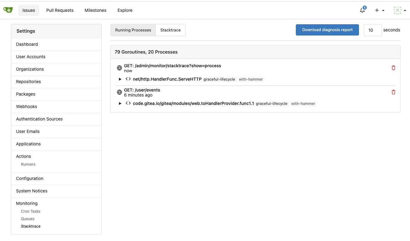
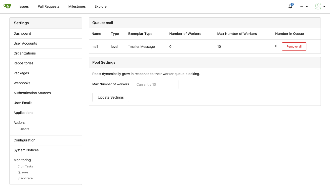
Improve queue & process & stacktrace (#24636)
Although some features are mixed together in this PR, this PR is not
that large, and these features are all related.

Actually there are more than 70 lines are for a toy "test queue", so
this PR is quite simple.

Major features:

1. Allow site admin to clear a queue (remove all items in a queue)
* Because there is no transaction, the "unique queue" could be corrupted
in rare cases, that's unfixable.
* eg: the item is in the "set" but not in the "list", so the item would
never be able to be pushed into the queue.
* Now site admin could simply clear the queue, then everything becomes
correct, the lost items could be re-pushed into queue by future
operations.
3. Split the "admin/monitor" to separate pages
4. Allow to download diagnosis report
* In history, there were many users reporting that Gitea queue gets
stuck, or Gitea's CPU is 100%
    * With diagnosis report, maintainers could know what happens clearly

The diagnosis report sample:
[gitea-diagnosis-20230510-192913.zip](https://github.com/go-gitea/gitea/files/11441346/gitea-diagnosis-20230510-192913.zip)
, use "go tool pprof profile.dat" to view the report.


Screenshots:

![image](https://github.com/go-gitea/gitea/assets/2114189/320659b4-2eda-4def-8dc0-5ea08d578063)


![image](https://github.com/go-gitea/gitea/assets/2114189/c5c46fae-9dc0-44ca-8cd3-57beedc5035e)


![image](https://github.com/go-gitea/gitea/assets/2114189/6168a811-42a1-4e64-a263-0617a6c8c4fe)

---------

Co-authored-by: Jason Song <i@wolfogre.com>
Co-authored-by: Giteabot <teabot@gitea.io>
2023-05-11 07:45:47 +00:00
wxiaoguang
6f9c278559
Rewrite queue (#24505)
# ⚠️ Breaking

Many deprecated queue config options are removed (actually, they should
have been removed in 1.18/1.19).

If you see the fatal message when starting Gitea: "Please update your
app.ini to remove deprecated config options", please follow the error
messages to remove these options from your app.ini.

Example:

```
2023/05/06 19:39:22 [E] Removed queue option: `[indexer].ISSUE_INDEXER_QUEUE_TYPE`. Use new options in `[queue.issue_indexer]`
2023/05/06 19:39:22 [E] Removed queue option: `[indexer].UPDATE_BUFFER_LEN`. Use new options in `[queue.issue_indexer]`
2023/05/06 19:39:22 [F] Please update your app.ini to remove deprecated config options
```

Many options in `[queue]` are are dropped, including:
`WRAP_IF_NECESSARY`, `MAX_ATTEMPTS`, `TIMEOUT`, `WORKERS`,
`BLOCK_TIMEOUT`, `BOOST_TIMEOUT`, `BOOST_WORKERS`, they can be removed
from app.ini.

# The problem

The old queue package has some legacy problems:

* complexity: I doubt few people could tell how it works.
* maintainability: Too many channels and mutex/cond are mixed together,
too many different structs/interfaces depends each other.
* stability: due to the complexity & maintainability, sometimes there
are strange bugs and difficult to debug, and some code doesn't have test
(indeed some code is difficult to test because a lot of things are mixed
together).
* general applicability: although it is called "queue", its behavior is
not a well-known queue.
* scalability: it doesn't seem easy to make it work with a cluster
without breaking its behaviors.

It came from some very old code to "avoid breaking", however, its
technical debt is too heavy now. It's a good time to introduce a better
"queue" package.

# The new queue package

It keeps using old config and concept as much as possible.

* It only contains two major kinds of concepts:
    * The "base queue": channel, levelqueue, redis
* They have the same abstraction, the same interface, and they are
tested by the same testing code.
* The "WokerPoolQueue", it uses the "base queue" to provide "worker
pool" function, calls the "handler" to process the data in the base
queue.
* The new code doesn't do "PushBack"
* Think about a queue with many workers, the "PushBack" can't guarantee
the order for re-queued unhandled items, so in new code it just does
"normal push"
* The new code doesn't do "pause/resume"
* The "pause/resume" was designed to handle some handler's failure: eg:
document indexer (elasticsearch) is down
* If a queue is paused for long time, either the producers blocks or the
new items are dropped.
* The new code doesn't do such "pause/resume" trick, it's not a common
queue's behavior and it doesn't help much.
* If there are unhandled items, the "push" function just blocks for a
few seconds and then re-queue them and retry.
* The new code doesn't do "worker booster"
* Gitea's queue's handlers are light functions, the cost is only the
go-routine, so it doesn't make sense to "boost" them.
* The new code only use "max worker number" to limit the concurrent
workers.
* The new "Push" never blocks forever
* Instead of creating more and more blocking goroutines, return an error
is more friendly to the server and to the end user.

There are more details in code comments: eg: the "Flush" problem, the
strange "code.index" hanging problem, the "immediate" queue problem.

Almost ready for review.

TODO:

* [x] add some necessary comments during review
* [x] add some more tests if necessary
* [x] update documents and config options
* [x] test max worker / active worker
* [x] re-run the CI tasks to see whether any test is flaky
* [x] improve the `handleOldLengthConfiguration` to provide more
friendly messages
* [x] fine tune default config values (eg: length?)

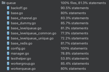
## Code coverage:
![image](https://user-images.githubusercontent.com/2114189/236620635-55576955-f95d-4810-b12f-879026a3afdf.png)
2023-05-08 19:49:59 +08:00
Gary Moon
b8c19e7a11
Update LDAP filters to include both username and email address (#24547)
Since the login form label for user_name unconditionally displays
`Username or Email Address` for the `user_name` field, bring matching
LDAP filters to more prominence in the documentation/placeholders.

Signed-off-by: Gary Moon <gary@garymoon.net>
2023-05-05 14:18:53 -04:00
silverwind
d6f8238492
Replace N/A with - everywhere (#24474)
Followup to https://github.com/go-gitea/gitea/pull/24427.

Reasoning is that `N/A` is specific to english while `-` is
language-neutral and does not need translation.

Before:
<img width="891" alt="Screenshot 2023-05-01 at 20 58 20"
src="https://user-images.githubusercontent.com/115237/235511592-8a36d0f2-34ff-4dbe-b642-67c0ade644fe.png">

After:
<img width="901" alt="Screenshot 2023-05-01 at 20 59 59"
src="https://user-images.githubusercontent.com/115237/235511594-d49f6d09-92e8-4e99-be7b-2a37f5d24129.png">
2023-05-02 05:54:29 -04:00
Yarden Shoham
94d6b5b09d
Add "Updated" column for admin repositories list (#24429)
- Closes #12454

# Before

![image](https://user-images.githubusercontent.com/20454870/235314351-82f5a414-7827-4029-8779-a837283a5a05.png)
# After

![image](https://user-images.githubusercontent.com/20454870/235314376-ccf4bb95-6823-4fce-9b9a-a23da2351769.png)

Signed-off-by: Yarden Shoham <git@yardenshoham.com>
2023-04-29 20:40:10 +02:00
wxiaoguang
241b74f6c5
Improve template helper (#24417)
It seems that we really need the "context function" soon. So we should
clean up the helper functions first.

Major changes:

* Improve StringUtils and add JsonUtils
* Remove one-time-use helper functions like CompareLink
* Move other code (no change) to util_avatar/util_render/util_misc (no
need to propose changes for them)

I have tested the changed templates:


![image](https://user-images.githubusercontent.com/2114189/235283862-608dbf6b-2da3-4d06-8157-b523ca93edb4.png)


![image](https://user-images.githubusercontent.com/2114189/235283888-1dfc0471-e622-4d64-9d76-7859819580d3.png)


![image](https://user-images.githubusercontent.com/2114189/235283903-d559f14d-4abb-4a50-915f-2b9cbc381a7a.png)


![image](https://user-images.githubusercontent.com/2114189/235283955-b7b5adea-aca3-4758-b38a-3aae3f7c6048.png)

---------

Co-authored-by: Giteabot <teabot@gitea.io>
2023-04-29 08:02:29 -04:00
wxiaoguang
5a5ab8ef5a
Start cleaning the messy ".ui.left / .ui.right", improve label list page, fix stackable menu (#24393)
Since 2015/2016, there is a global pollution: ".ui.left" / ".ui.right".

Fomantic UI doesn't work this way, it just conflicts with many Fomantic
definitions.

This PR starts the cleaning work of such techinical debts.

And, the "label list" page has been quite messy for long time, for
example, why "li" appears in "div" ......

And fix #24296

<details>


![image](https://user-images.githubusercontent.com/2114189/235051281-54c5374c-b5fd-4b5f-9aa2-02d4bb2d9112.png)


![image](https://user-images.githubusercontent.com/2114189/235055703-2ba042e0-4db7-4e63-8646-02f390d496b5.png)


![image](https://user-images.githubusercontent.com/2114189/235056310-4f6ffdc2-5758-4927-8fb8-314d9fb72a6b.png)


![image](https://user-images.githubusercontent.com/2114189/235058400-dab1c9ec-3325-4671-8345-aee6b0b68042.png)


![image](https://user-images.githubusercontent.com/2114189/235058424-85509532-b9bc-43ad-b00f-a87184c60f22.png)

</details>
2023-04-29 07:35:59 -04:00
wxiaoguang
83022013c8
Fix layouts of admin table / adapt repo / email test (#24370)
Ref:
https://github.com/go-gitea/gitea/pull/24315#pullrequestreview-1403034993

And fix the incorrect layout for "dasbboard", the "form" shouldn't
follow `<h4 class="ui top attached header">`, so move it to inner.

Diff with ignoring spaces:
https://github.com/go-gitea/gitea/pull/24370/files?diff=unified&w=1

A known bug: the adapt/delete button doesn't work due to a historical
messy logic, will fix it in next PR (#24374)

![image](https://user-images.githubusercontent.com/2114189/234754656-d160b098-b8d4-4783-962a-27d5c764863c.png)

![image](https://user-images.githubusercontent.com/2114189/234762327-3e77e2e4-a156-4498-8a8b-092e14cf9204.png)

![image](https://user-images.githubusercontent.com/2114189/234767811-74b7272c-e40c-4850-8e3c-499e3b53b827.png)

![image](https://user-images.githubusercontent.com/2114189/234761247-e6aad889-dcad-443c-948f-2d44df68725b.png)
2023-04-28 09:48:41 +08:00
Hester Gong
63a401ac40
Move secrets and runners settings to actions settings (#24200)
This PR moves the secrets and runners settings to actions settings on
all settings(repo,org,user,admin) levels.

After this PR, if
[ENABLED](5e7543fcf4/custom/conf/app.example.ini (L2604))
inside `app.ini` under `[actions]` is set to `false`, the "Actions" tab
(including runners management and secrets management) will not be shown.

After, the settings under actions settings for each level:

1. Admin Level
"Runners Management"
<img width="1437" alt="Screen Shot 2023-04-26 at 14 34 20"
src="https://user-images.githubusercontent.com/17645053/234489731-15822d21-38e1-4560-8bbe-69f122376abc.png">

2. User Level
"Secrets Management"
<img width="1427" alt="Screen Shot 2023-04-26 at 14 34 30"
src="https://user-images.githubusercontent.com/17645053/234489795-68c9c0cb-24f8-4f09-95c6-458ab914c313.png">

3. Repo and Organization Levels
"Runners Management" and "Secrets Management" 
   Org:
<img width="1437" alt="Screen Shot 2023-04-26 at 14 35 07"
src="https://user-images.githubusercontent.com/17645053/234489996-f3af5ebb-d354-46ca-9087-a0b586845281.png">

<img width="1433" alt="Screen Shot 2023-04-26 at 14 35 14"
src="https://user-images.githubusercontent.com/17645053/234490004-3abf8fed-81fd-4ce2-837a-935dade1793d.png">

    Repo:
<img width="1419" alt="Screen Shot 2023-04-26 at 14 34 50"
src="https://user-images.githubusercontent.com/17645053/234489904-80c11038-4b58-462c-9d0b-8b7cf70bc2b3.png">
    
<img width="1430" alt="Screen Shot 2023-04-26 at 14 34 57"
src="https://user-images.githubusercontent.com/17645053/234489918-4e8d1fe2-9bcd-4d8a-96c1-238a8088d92e.png">

It also finished these tasks :

- [x] rename routers function "runners" to "actions", and refactor
related file names
- [x] check and modify part of the runners related functions to match
their name
- [x] Fix backend check caused by fmt check

---------

Co-authored-by: wxiaoguang <wxiaoguang@gmail.com>
2023-04-27 20:08:47 -04:00
Hester Gong
f1a4330306
Modify width of ui container, fine tune css for settings pages and org header (#24315)
Close #24302 
Part of #24229, Follows #24246
This PR focused on CSS style fine-tune, main changes:

1. Give `.ui.ui.ui.container` a width of `1280px` with a max-width of
`calc(100vw - 64px)`, so the main contents looks better on large
devices.

2. Share styles for table elements in all levels settings pages to fix
overflow of runners table on mobile and for consistency (The headers on
mobile can be further improved, but haven't found a proper way yet).

3. Use [stackable
grid](https://fomantic-ui.com/collections/grid.html#stackable) and
[device column width](https://fomantic-ui.com/examples/responsive.html)
for responsiveness for some pages (repo/org collaborators settings
pages, org teams related page)

4. Fixed #24302 by sharing label related CSS in reporg.css

5. Fine tune repo tags settings page

---------

Co-authored-by: wxiaoguang <wxiaoguang@gmail.com>
2023-04-26 11:59:08 -04:00
Yarden Shoham
eea23bbc8e
Remove unnecessary helper function DateFmtLong (#24343)
After #24317 this function is only used in one place where it is not
needed. I confirmed the timestamp still renders correctly

Signed-off-by: Yarden Shoham <git@yardenshoham.com>
2023-04-26 02:52:50 -04:00
wxiaoguang
0e8045d8ea
Fix template function DateTime (#24317)
Before, 500 error


![image](https://user-images.githubusercontent.com/2114189/234170176-403ffd1b-ec27-42be-bff9-86184dc8d74d.png)
2023-04-25 15:48:30 -04:00
wxiaoguang
75c62054a6
Improve some modal action buttons (#24289)
Follow #24097 and #24285

And add a devtest page for modal action button testing.
http://localhost:3000/devtest/fomantic-modal

Now the `modal_actions_confirm.tmpl` could support: green / blue /
yellow positive buttons, the negative button is "secondary".

ps: this PR is only a small improvement, there are still a lot of
buttons not having proper colors. In the future these buttons could be
improved by this approach.

These buttons could also be improved according to the conclusion of
#24285 in the future.


![image](https://user-images.githubusercontent.com/2114189/233847773-a6d6b29b-7b5c-490e-8425-40dfd0ad2529.png)


And add GitHub-like single danger button (context:
https://github.com/go-gitea/gitea/issues/24285#issuecomment-1519100312)


![image](https://user-images.githubusercontent.com/2114189/233891566-055d7611-894d-4d5a-baf5-f6369180bf8d.png)

---------

Co-authored-by: silverwind <me@silverwind.io>
2023-04-24 07:08:59 -04:00